Design and UX
Web design in 2026: what actually sells
 Juro
Trends come and go, but the reasons a visitor writes to you or leaves change slower than the think-pieces suggest. Here is what actually decides on websites in 2026.
Every year the trend lists come out, and every year half of them evaporate by summer. But a company ordering a new website doesn't need to care about trends. It needs to care about one thing: what convinces a visitor to write. These are the five things with the biggest influence on that in 2026.
1. Proof instead of promises
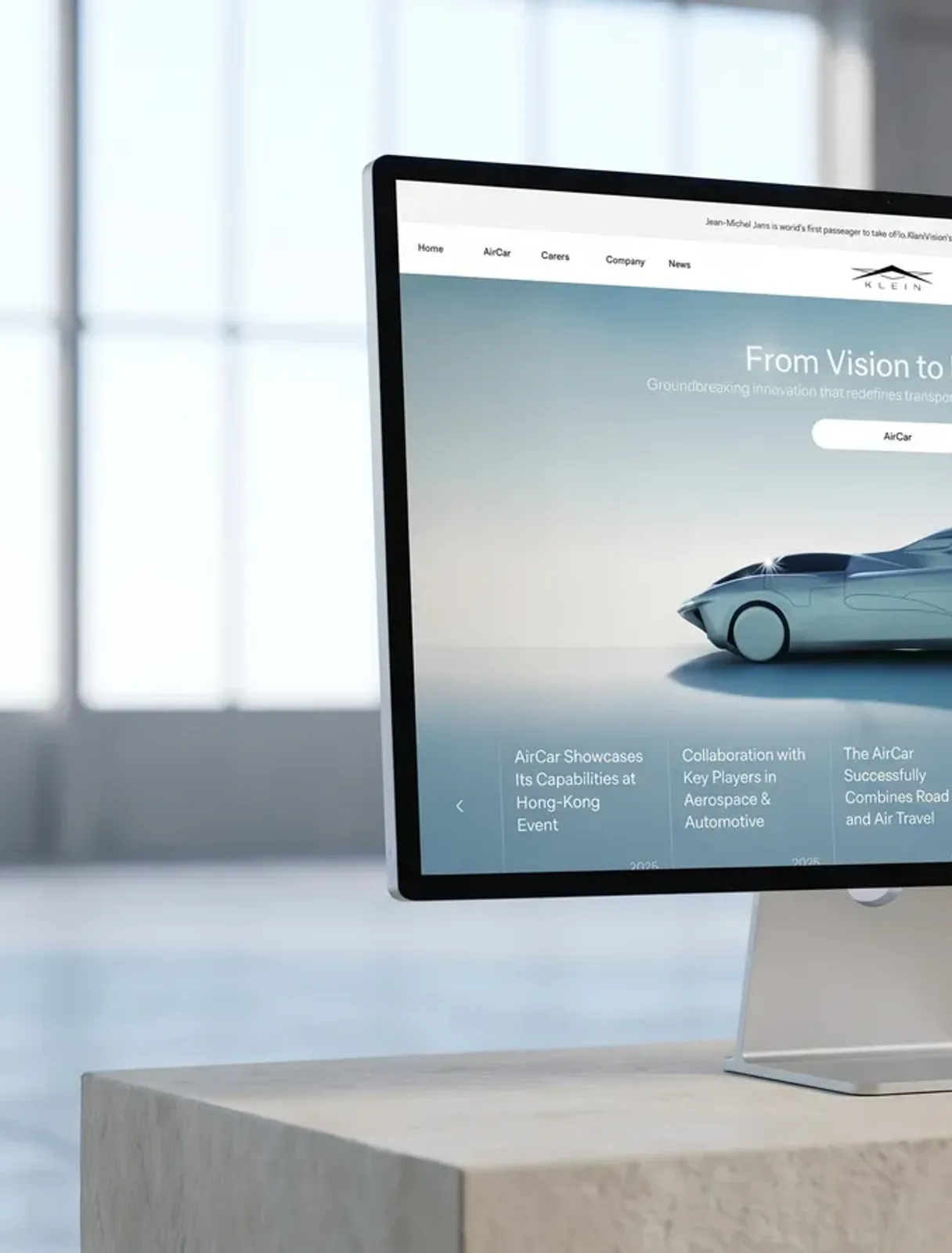
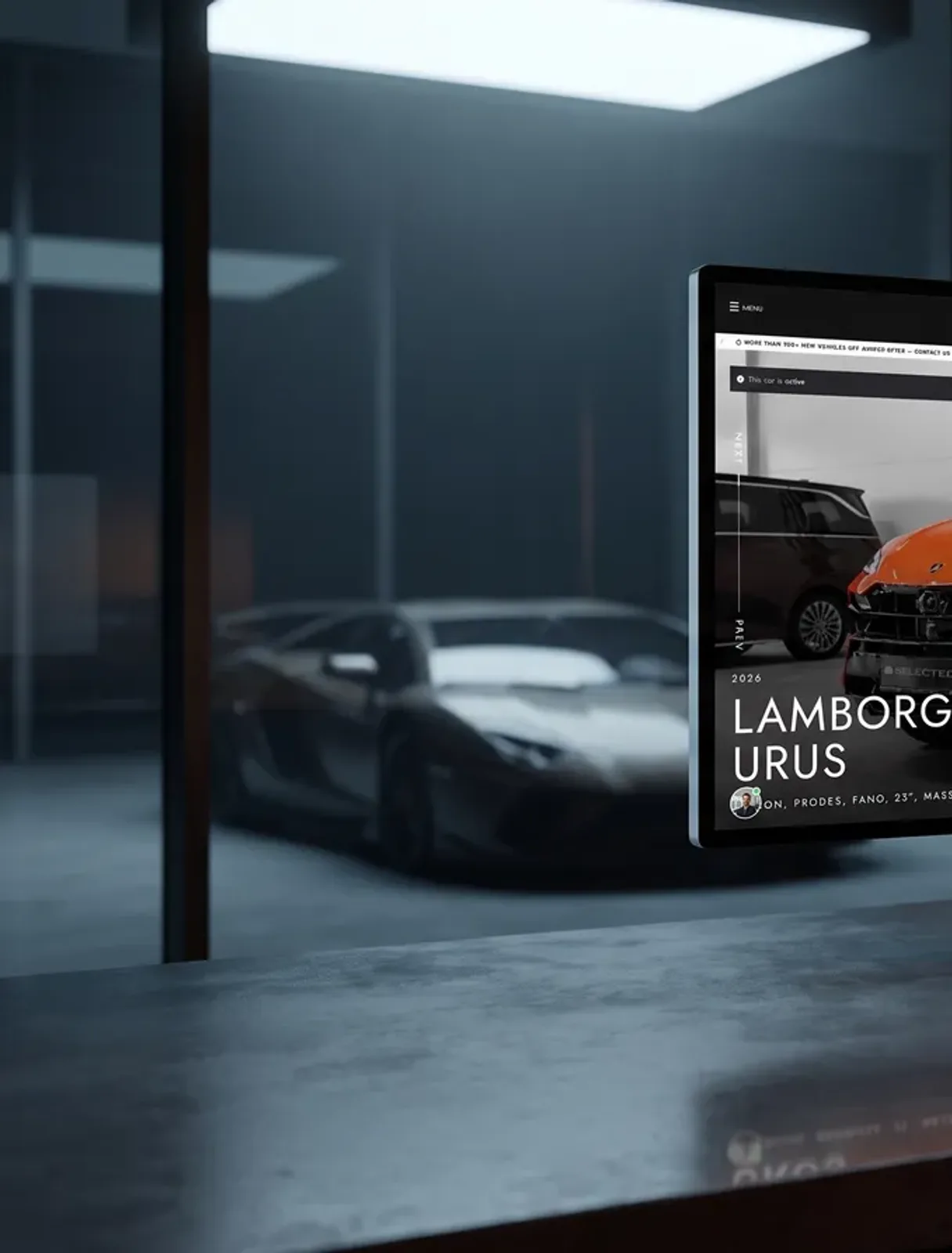
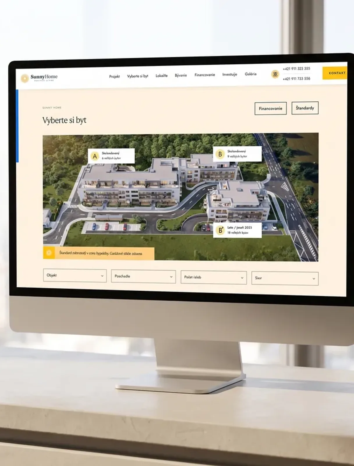
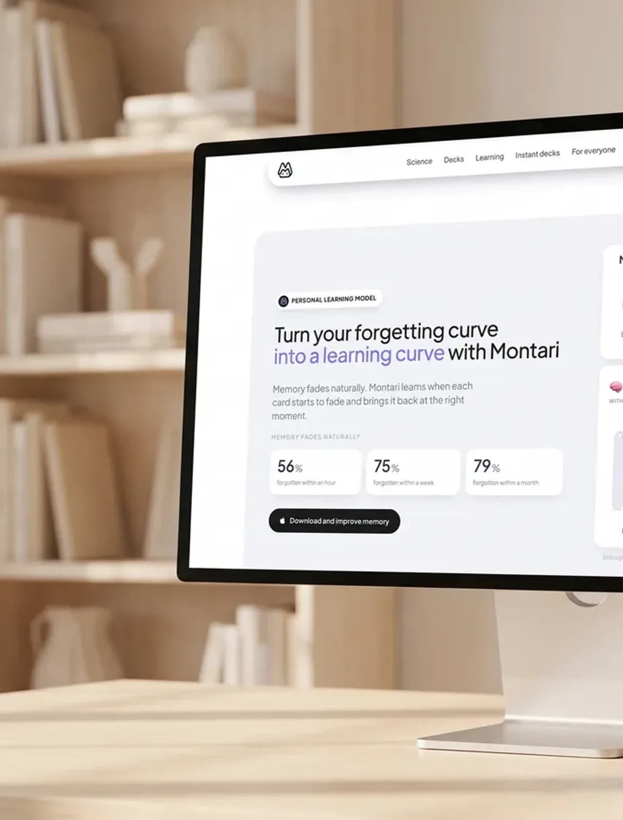
Websites full of phrases about innovation and complex solutions have stopped working. Visitors want to see the work, not read about it. Websites that sell show the product in the first screen: the real interface, the real project, the real reference. If you have something to show, show it before you write anything. If you don't, that's a problem the website only appears to have.
2. Speed is part of the brand
A slow website says more about a company than a slogan. Visitors won't remember the animation that took three seconds to load, but they will remember the feeling that it dragged. And speed isn't a technical detail at the end of the project; it's a design decision from the start: how much you put on the page and what you're willing to give up.
3. Calm typography, generous space
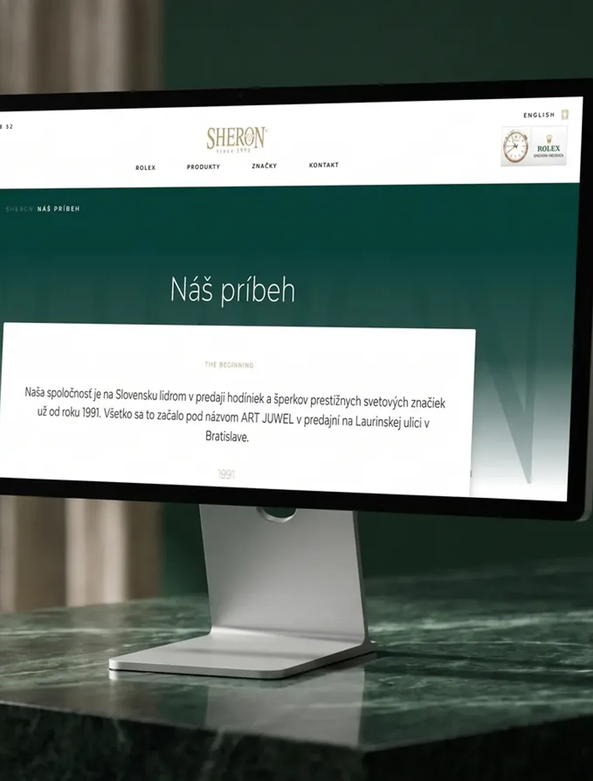
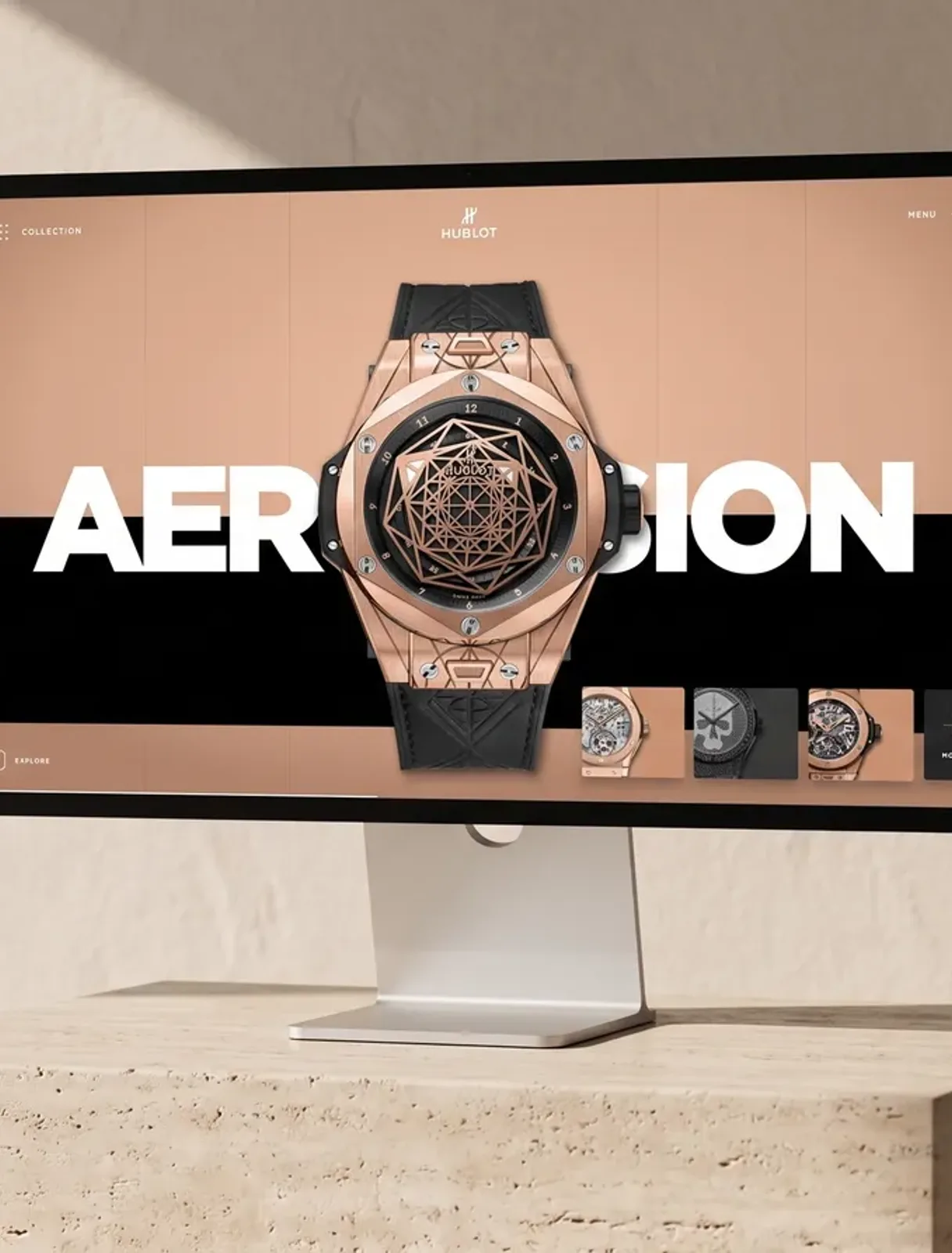
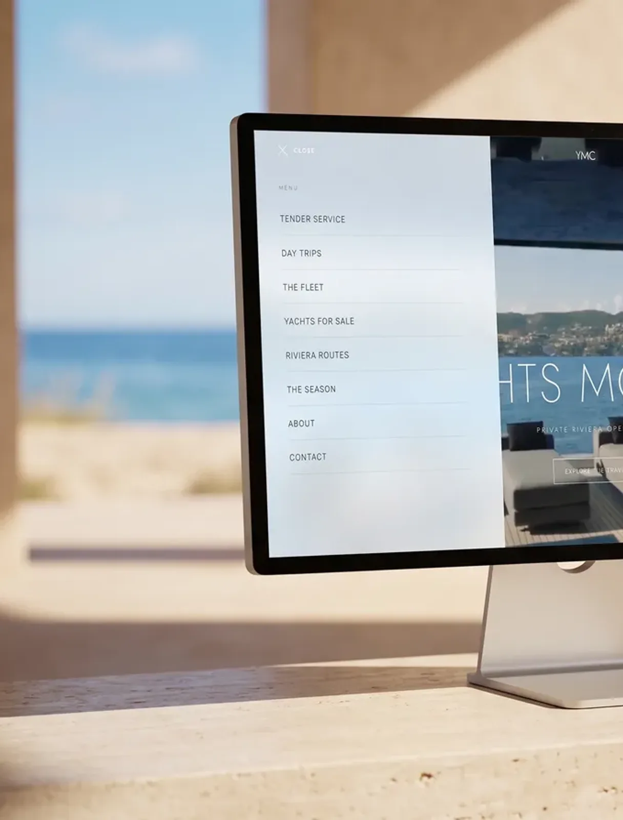
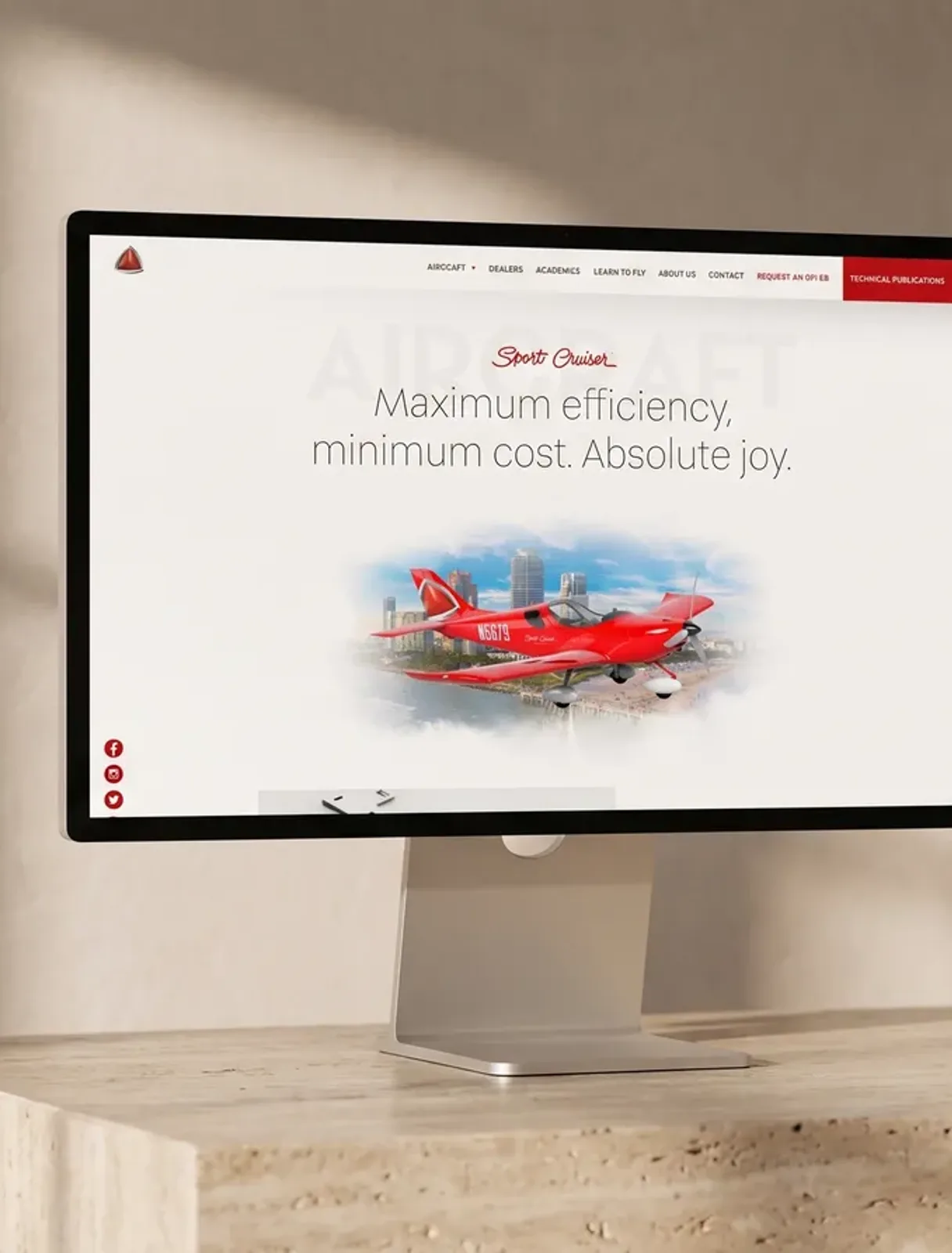
The clearest shift of recent years is towards quiet. Large headlines, plenty of air, few elements at once. Not because it's pretty, but because a crowded screen forces the brain to choose, and a choosing brain prefers to leave. The websites that feel expensive are almost always the ones that show less.
4. Micro-motion in moderation
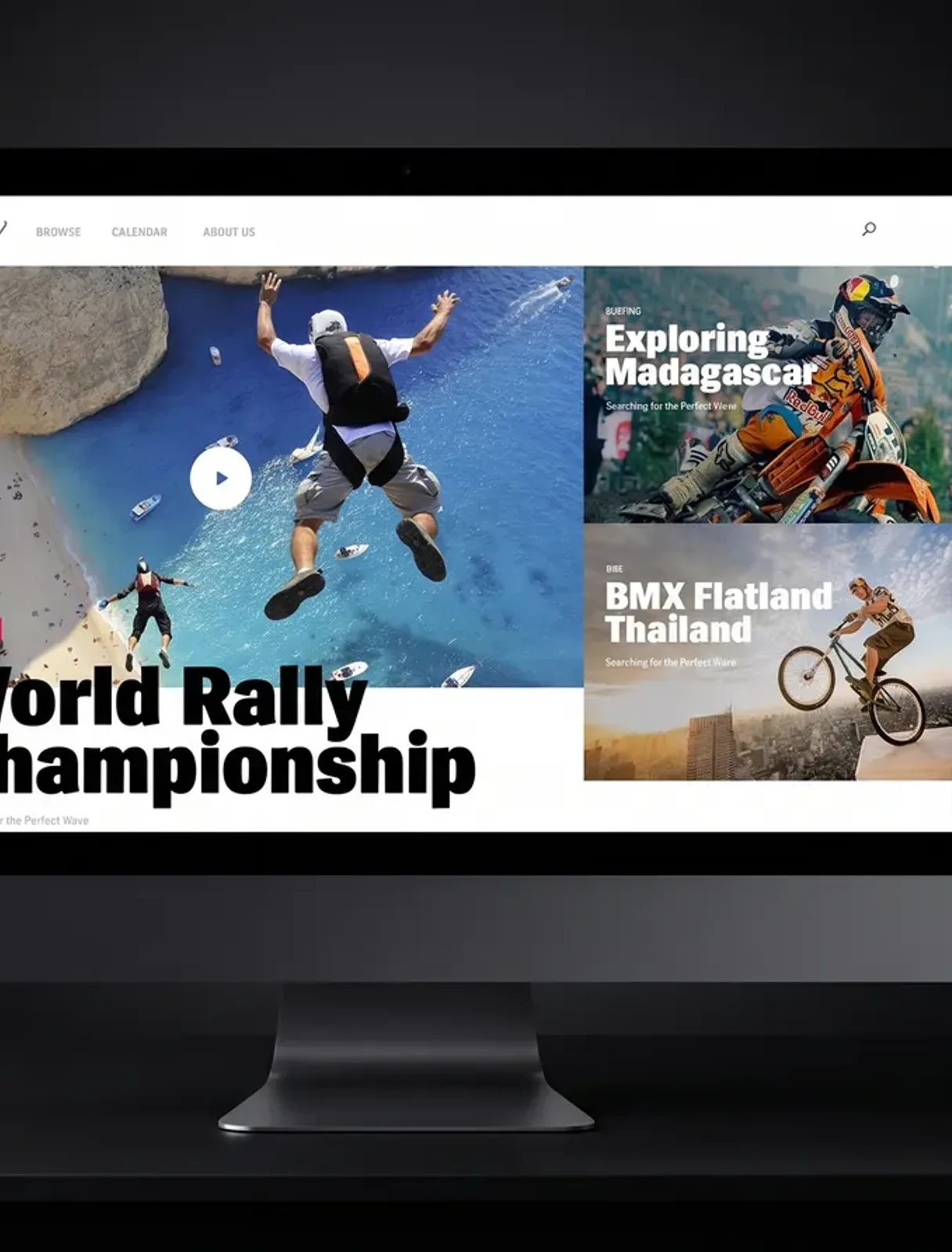
Animation makes sense when it says something: that the page loaded, that something changed, that the system is alive. Animation for effect is, in 2026, the same kitsch as a Flash intro in 2006. A rule from practice: remove the motion, and if the page works worse, it belonged there. If nobody notices, it didn't.
5. The website as the start of a system, not the end of a project
The biggest change isn't visual. The website is ceasing to be a brochure and becoming the entrance to a system: a form enquiry gets an answer within a minute, the calendar offers a slot, the materials prepare themselves. Companies that have this win not with prettier design but by answering first. Design opens the door; the system walks the visitor through it.
What to take away
- Show the work in the first screen. Proof sells, promises don't.
- Speed is a design decision, not a technical detail.
- Fewer elements on screen means a more expensive feel and more enquiries.
- Every motion on the page must say something, otherwise it's noise.
- A website without a system behind it is just a brochure. Whoever answers first wins.